
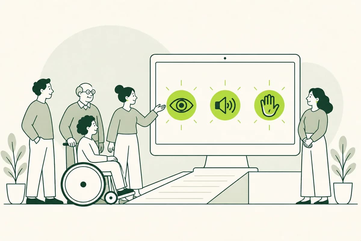
Accessibility Starts with Independent Use
A website is accessible if people can use it reliably, regardless of varying abilities or usage contexts. This includes blind and visually impaired individuals, deaf people, those with motor or cognitive impairments, and many older users. Temporary factors - such as a broken hand, a noisy environment, or a slow internet connection - can also make usage difficult. Accessibility is therefore not aimed at a small, niche group; rather, it improves access for a wide range of people.
Whether a service is truly accessible becomes apparent through specific tasks. Can a person find an appointment, submit a form, or copy a phone number without getting stuck in the navigation? Do they understand what information is required and what happens after submission? A well-intentioned nod to accessibility does little good if crucial information appears only in a graphic or if a dialog box cannot be closed without a mouse.
A simple shift in perspective helps site operators: the focus should not be on individual functions, but on the entire journey toward the goal. A highly readable homepage is not enough if the ordering process remains confusing. Therefore, start by looking at the paths your visitors take most frequently. That is where barriers become most apparent, and where improvements immediately foster greater independence, security, and confidence.
A clear page structure provides reliable orientation
People process websites in different ways. Some skim-read headings, others significantly magnify the content, and blind users have elements read aloud by a screen reader. A clear structure helps in all these situations. Every page should have a recognizable main topic, and headings should logically divide the content. Even someone reading only the headings should be able to understand the subject matter and locate the information they are looking for.
Recurring elements also need a fixed location. The logo, main navigation, search function, and contact details should not change position or label from page to page. A consistent layout eases the burden on people who struggle with orientation or memorizing processes. Meaningful page titles and a clear indication of the current section are particularly helpful. This allows users to see where they are at any time and how to return to a higher-level topic.
Avoid pages where many equally prominent areas compete for attention. If three banners, several tiles, and an automatically rotating image dominate the initial view, the most important information becomes unclear. Arrange content according to importance and give the primary action a prominent spot. A calm, clear hierarchy not only aids orientation but also speeds up decision-making and reduces accidental clicks.
A readable design works without guesswork
Good readability is achieved through sufficiently large fonts, clear character shapes and sufficient spacing between lines and paragraphs. Very thin font or closely spaced text can be strenuous, even if you have good eyesight. The problem is exacerbated on small screens. Users should be able to zoom in on text without cutting off content or requiring side-scrolling. Therefore, check not only the normal view, but also significantly enlarged images.
Color may support information, but not carry it alone. A red border around an incorrect form field may not be visible to people with limited color vision. Add a clear message and clearly mark the affected field. The same applies to diagrams, status displays and selected menu items. Patterns, symbols or text ensure that the meaning is retained even without accurate color perception.
Sufficient contrast makes text, buttons and input fields visible under different lighting conditions. Light gray on a white background often looks elegant, but is quickly unreadable. Small notes, placeholders and captions on images are particularly critical. Check contrasts during design and not just before publication. This means that colors remain changeable without having to laboriously repair a finished appearance.
All important functions must be accessible via keyboard
Not everyone can use a mouse or touchscreen safely. Some only use the keyboard, voice input or another input device. Therefore, links, buttons, menus and form fields must be accessible in a comprehensible order. With the tab key, the focus should follow the visible structure of the page. Jumping into hidden areas or circling within a component makes even simple tasks unnecessarily difficult.
The current focus must remain clearly visible. A fine shadow that can hardly be distinguished from the background is not enough. Anyone who navigates with the keyboard must be able to see at any time which element will be triggered the next time a key is pressed. Only remove the default focus marker when designing a replacement that is at least as clear. This also applies to menus, cookie dialogs, search suggestions and displayed windows.
Test central routes completely without a mouse. Open the navigation, select an offer, fill out a form and close all dialogs. Pay attention to places where the focus disappears or an action is only possible by dragging, swiping or pointing. This simple experiment reveals many obstacles that go unnoticed when using the mouse as usual.
Understandable content leads to the right action more quickly
Accessible content tells early on what readers need to know or do. Start with the most important statement and then explain necessary details. Long introductions, internal technical terms and unclear references make orientation difficult. Instead of “You can find more information here,” a link should state its destination, such as “Documents for the housing benefit application.” This means that its meaning remains understandable even if it is read outside the paragraph.
Short sentences are helpful, but comprehensibility does not mean oversimplifying every piece of content. Explain unfamiliar terms where they are needed and use the same term consistently. If a site alternately talks about customer account, profile and user area, unnecessary uncertainty arises. Concrete examples are particularly helpful with deadlines, requirements or ambiguous decisions, as long as they do not replace the actual content.
Headings, labels and buttons should reliably meet expectations. A button that says “Next” reveals little, while “Check details” explains the next step. Warnings should state the problem and the possible solution. Friendly, direct formulations support people with little reading experience as well as people who act under time pressure. Clear text is therefore an essential part of the operation and not a later linguistic embellishment.
Forms need clear questions and helpful feedback
Forms are one of the most common places where people leave a website. Each field needs a permanently visible label that explains its purpose. An example in the field can help additionally, but should not replace the label because it disappears when typing. Only ask for information that is really needed for the process. Shorter forms are easier to understand, quicker to complete and cause fewer errors.
Mandatory fields and expected formats must be recognizable before entry. If a specific spelling is required for a date, provide an understandable example. Allow common variations where possible, rather than turning people away because of spaces or hyphens. For longer processes, a clear progress indicator helps as long as it shows which part is being processed and how many steps still follow.
If an error occurs, the message must be near the affected field and specifically explain what needs to be changed. “Invalid entry” leaves users alone, while “Please enter the zip code with five digits” offers a solution. After sending, a clear confirmation is also required. It should state whether the transmission was successful and when a response can be expected.
Images, audio and video need equal access
Images often convey information that is missing from the surrounding text. An alternative text then briefly describes what is important for the purpose of the page. For a photo in a team profile, name and function can be sufficient. With a diagram, on the other hand, the message and relevant values must be accessible even without an image. Purely decorative images should be skipped by assistive technologies so that they do not lengthen the content with meaningless file names or repetitions.
Videos require subtitles for spoken content and important sounds. If visible actions are not apparent from the sound, an additional audio description may be necessary. A transcript offers further access and makes it easier to read or search for individual statements. Subtitles should be checked carefully because automatically generated versions often mix up names, technical words or numbers and can therefore change the meaning.
Media must not start unexpectedly with sound. Moving content should be paused if it distracts for a longer period of time or makes reading difficult. Also watch out for fast flashing effects and hectic transitions. A control is only helpful if its buttons are clearly labeled and can be accessed via the keyboard. This means the content can still be used by people with hearing, visual or concentration impairments without disturbing other visitors.
The quality is particularly evident on small screens
Many people visit websites primarily using their smartphones. This is where little space, changing lighting conditions and finger-operated operation come together. Contact surfaces should therefore be large enough and have sufficient distance from each other. A small close button at the edge of a dialog can be almost inaccessible to people with limited mobility. Well-placed, clearly labeled controls prevent unintentional actions.
Content should adapt to narrow views without losing important functionality. Pay particular attention to tables, maps, cookie settings and multi-level navigations. If information only appears when the mouse cursor hovers over an element, it is completely missing on touch devices. Provide the same functionality with a tap or a visible link and ensure that displayed content can be easily closed again.
The orientation of the device should not be prescribed without good reason. Some people attach their tablet or smartphone to a fixed holder and cannot rotate it. This can make a page that only works in portrait format unusable. Flexible design takes such situations into account right from the start and combines mobile usability with accessibility instead of treating both topics separately.
Real usage testing finds more than automated checks
Automatic inspection tools can quickly find missing labels, weak contrasts and certain errors in the structure. They are a useful way to get started, but they don't tell you whether navigation is understandable or whether an error message really helps. A technically existing alternative text can still be useless. Results from such tools should therefore be understood as indications and checked by people who can assess the context of the page.
Supplement technical control with simple manual tests. Zoom in on the page, operate it using only the keyboard, and listen to key sections with a screen reader. Tests with people who use different tools and strategies in everyday life are even more meaningful. Give them a real task, like finding an event or sending a request, and notice where direction or action stalls.
Feedback should be evaluated based on its impact. An inaccessible booking or missing health information is more urgent than a small distance error. Record which problem occurs on which page and which users are affected. After correction, the same path must be checked again. In this way, a long collection of general information becomes a comprehensible improvement in actual use.
Accessibility becomes permanent when responsibility is clear
An accessible website doesn't come from a one-time revision. New content, features and campaigns can introduce new obstacles at any time. Therefore, each role involved needs appropriate responsibility. Editorial teams pay attention to understandable texts and image descriptions, design teams pay attention to contrasts and conditions, development teams pay attention to operation and technical structure. Anyone who releases content should know which basic characteristics need to be checked before publication.
Accessible templates and reusable components are helpful. If forms, dialogs and navigation are already cleanly designed and checked, teams don't have to solve the same problems on every page. Editorial interfaces should query necessary information such as alternative texts in an understandable way. At the same time, there needs to be room for exceptions, because a complex diagram requires a different description than a decorative photo. Good basics make it easier to implement them correctly in everyday life.
The greatest practical benefit occurs when visitors can complete important tasks without avoidable obstacles. Start with the most used paths, address serious barriers, and test the impact with real users. Not only does the accessibility of individual pages gradually improve, but the quality of the entire offering. An inclusive online presence is created where comprehensibility, design and technology are jointly geared towards independent use.