
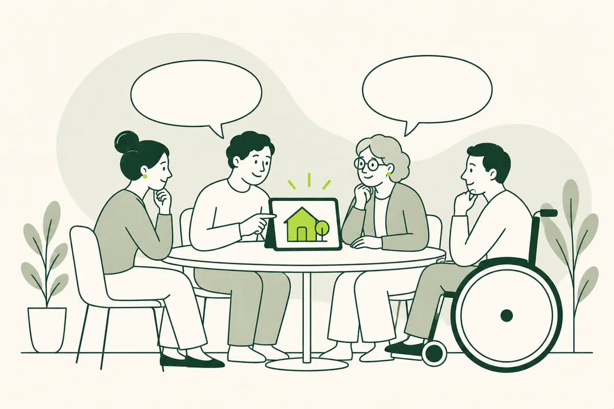
Tailoring the test to a specific reading scenario
Before conducting a target audience test, it should be clear what content will be used and in what context. An appointment change entails different requirements than a page about long-term care services. The selected excerpt must provide enough context for people to take meaningful action. While an isolated paragraph can be evaluated for language, it rarely reflects the actual process of searching for information.
The prepared version should resemble the final offering as closely as possible. A headline on a loose sheet of paper is perceived differently than the same headline surrounded by navigation elements, images, and additional notes. For early drafts, a simple prototype suffices, provided that links, the sequence, and visible states credibly represent the intended usage. Technical perfection is not required for this.
A dry run with someone not involved in the project helps before the first actual session. It reveals whether the task is clear, the materials are complete, and the recording or note-taking setup works properly. This process does not pre-empt the final result; rather, the dry run protects the invited participants' time by preventing avoidable organizational errors.
A real-world task reveals more than a question of personal preference
A clear test begins with a credible scenario. For instance, a participant might be asked to find out which documents they need to bring to an appointment. Another person wants to know if they can apply for a subsidy. The task provides a reason to read without revealing the specific words to be found on the page.
Asking "Which headline do you prefer?" can assist with editorial decisions but reveals little about comprehension. It is more telling to observe which headline a person chooses when looking for the relevant information. If multiple people skip the correct section, the issue may not be a matter of taste, but rather unclear labeling or sequencing.
Tasks should not be a test of the participants themselves; the content is being evaluated, not their reading ability. If someone stumbles or gives an incorrect answer, it offers insight into the page itself. A respectful introduction alleviates performance anxiety and clarifies that difficulties provide particularly valuable feedback. Conversely, praising "correct" answers would recreate a testing atmosphere.
Recruiting the right people for the content
The target audience includes people who actually need the content or could use it in a similar situation. Different experiences are relevant for information on care services compared to a public transport ticketing app. Age or educational background alone provide only a rough picture of these differences; factors such as usage experience, language proficiency, disabilities, and familiarity with the subject matter can be just as crucial.
A group should not consist solely of highly confident readers. People who rarely fill out forms, use German as an additional language, or rely on assistive technologies often encounter hurdles that others overlook. Not every characteristic needs to be represented in every test; the selection should align with the people who would be most affected by errors in the specific content.
Colleagues, friends, or family members are easy to reach but often share similar knowledge and habits. They can provide an initial impression but do not replace the intended target audience. Compensating participants appropriately for their time and experience shows respect and enables participation for those who cannot afford to take part without payment. Travel costs, assistance, and breaks can also determine who is able to participate.
An accessible testing environment fosters honest insights.
The test itself must not create additional barriers. A hard-to-reach location, inaccessible video technology, or complex consent forms can exclude people whose perspectives are particularly important. Participants should know in advance what to expect, how long the session will take, and what support or technology is available for them to use.
Some people prefer reading on paper, while others enlarge text on their own devices or use screen readers. A familiar usage scenario yields more realistic results than an unfamiliar test device. If the website is intended to function under normal conditions using personal assistive tools, it should ideally be experienced and observed in that same way.
Conducting the conversation calmly helps avoid leading the participant to specific answers. Brief pauses are acceptable. Immediately pointing out where information is located deprives the person of the chance to demonstrate their own navigation path. Support is appropriate when necessary for comfort or accessibility, but it should remain recognizable as part of the observation process. Allowing participants to end a session without giving a reason also fosters a sense of security. Before any recording takes place, there must be a clear explanation of what is being stored, who will see it later, and why.
Gaining insight through storytelling and action
Asking directly, "Did you understand everything?" often elicits a polite affirmative response. People do not want to appear unprepared or feel pressured to give the "right" answer. Open-ended questions reveal more. When someone explains the subject matter in their own words, misunderstandings and overlooked conditions become apparent - without the need to quiz them on textbook knowledge.
For content involving specific actions, the next decision a user makes is particularly revealing. After reading a text about a schedule change, the person can demonstrate which date they would enter into their calendar. On a form-based page, they can explain which document they would obtain first. A correct action demonstrates that multiple pieces of information have been understood in combination.
Hesitation, backtracking, and re-reading are also important signals. They do not automatically mean a section is poorly written, but they do indicate increased cognitive effort. A quick follow-up question can clarify whether the cause was an unfamiliar word, an unclear heading, or a lack of context. In this way, observation turns into actionable editorial insight. The precise moment of hesitation is often more significant than a later recollection.
Uncovering misunderstandings behind simple words
A word may be widely known yet still be misunderstood in a specific text. *Leistung* (performance/service/benefit), for instance, can refer to a financial payment, a form of support, or work that has been performed. *Stelle* (position/place/passage) can mean a job, a government agency, or a specific section of text. Target audience testing reveals not only whether people recognize a word but also the meaning they attribute to it in a given context.
Terms that seem self-evident within an organization are particularly revealing. An editorial team might know that a "customer number" and a "contract number" are two distinct pieces of information. Readers, however, simply look for any long number on their correspondence. Conversations reveal which additional descriptions or examples enable them to correctly identify the right number.
Even seemingly simple substitute words can shift the meaning. If a fee is simply labeled a "price," people might expect the purchase to be voluntary. If a formal objection is described merely as a "complaint," its legal function remains unclear. Considering the target audience helps determine whether a simplification actually clarifies the meaning or simply sounds more familiar. Multiple interpretations of the same word often indicate a lack of context.
Considering navigation and text together
Content is rarely read from top to bottom. People skim headings, follow links, or look for a familiar word. If the information they are seeking isn't found, a paragraph might be perfectly clear yet still fail to be effective. Testing with the target audience therefore reveals whether labels, page structure, and visual cues actually guide users in the right direction.
Take, for example, a page with a link labeled "Prerequisites." Content creators expect this section to contain information on who is eligible to apply. Users, however, might look for a link like "Who can get help?" If they overlook the technical term, it reveals a gap between the internal organizational structure and the users' actual questions. A more intuitive label can make the content discoverable without needing to repeat it.
This experience changes on small screens. Important information shifts further down the page, accordion menus hide sections, and long words may wrap awkwardly. Testing on the actual devices users employ reveals these dynamics. Text clarity cannot be fully separated from the page's layout and usability. Slow internet connections can also influence which content is actually noticed.
Interpreting individual reactions correctly
Everyone brings their own unique experiences. One participant might be familiar with a technical term from their profession, while another might have had a bad experience with a similar application process. Consequently, a single reaction does not prove a general rule. Nevertheless, it can point to a significant risk that warrants closer examination in the text.
Recurring difficulties are particularly telling. If multiple people miss the same deadline or misinterpret the same link, it strongly suggests a hurdle related to the content. Varied errors can also stem from a common cause; for instance, an unclear heading might lead some users to quit too early while causing others to continue reading in the wrong section.
Numbers alone do not explain these observations. Noting that four out of six people failed to find the phone number reveals the scale of the problem but not the reason behind it. Only conversations reveal that the number was listed under an unexpected heading or designed to look like an advertisement. Effective analysis combines frequency with the context of the user experience. Even an infrequent problem can be serious if it blocks a key function.
Recording observations without revealing personal identities
Notes should capture the observed level of understanding rather than unnecessary details about the individual. For editorial purposes, it is usually sufficient to record where a user hesitated, how a statement was interpreted, and what action followed. Personal anecdotes, full names, or information unrelated to the study do not belong in the analysis.
Pseudonyms or neutral identifiers serve to separate observations from contact details. Consent records, scheduling information, and session recordings may require different access rights and retention periods. Access should be restricted to those who need the material for moderation or analysis. Once the agreed-upon timeframe has elapsed, recordings and any personal notes that are no longer needed must be securely deleted. This deletion process should also cover any existing copies.
The report should describe the difficulty respectfully. Instead of portraying a person as overwhelmed, the report simply notes that the link under the chosen heading was not found. Brief quotes can substantiate an interpretation but should not reveal a person's identity or sensitive life circumstances. This ensures the experience remains credible without turning participants into mere case studies. Raw footage does not need to be shared to create a compelling presentation.
Testing the revised version again
After the initial analysis, a concrete new version is required. Changes should address the observed root cause rather than merely shifting visible symptoms. If users missed a deadline, a clearer sequence might help. Conversely, if it was unclear to whom the deadline applied, the text needs a precise condition rather than just greater emphasis.
The modified section should be tested again using the same realistic task. This reveals whether the original obstacle has been removed and whether the solution creates new confusion. New participants are better suited for this than individuals who already know the content and the expected answer from the first session.
A follow-up test does not need to examine the entire content from scratch. It can focus on the specific path in question while maintaining its broader context. If users can now find, correctly interpret, and apply the relevant information, the revision is robust. Open observations remain visible and can be revisited in a later version.
Authoritative sources
- W3C WAI: Involving people with disabilities in web accessibility evaluation
- GOV.UK Service Manual: Finding participants for user research
- GOV.UK Service Manual: Conducting research sessions with disabled people
- GOV.UK Service Manual: Planning a round of user research
- GOV.UK Service Manual: Informed consent for user research