Help people find understandable content faster
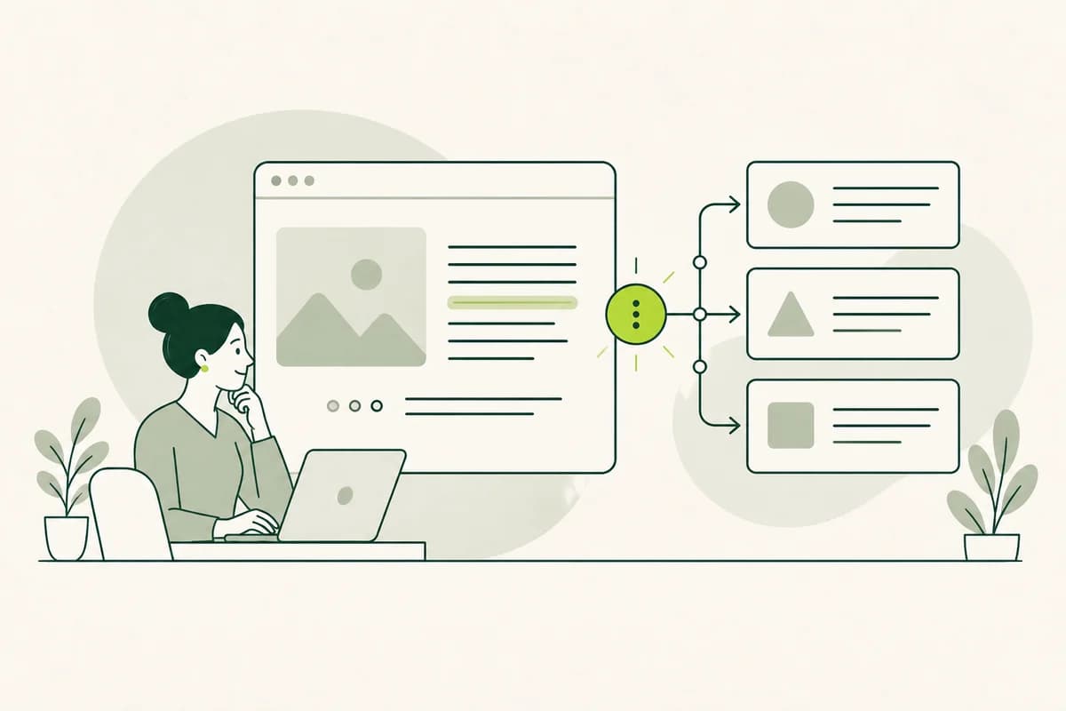
A website widget is a small control element that allows visitors to select a different language or language style. It can appear in the header, in the page margin, or as a prominent button. Its benefit is simple: people can find accessible versions more quickly without having to search through menus or a separate overview page for the right option.
The widget itself does not make a website accessible. It merely leads to content that has been carefully written, translated, and reviewed beforehand. If the main page remains complex and the widget displays an automatically shortened version that has not been checked, the barrier is simply shifted elsewhere. True accessibility stems from accessible content and a reliable way to reach it.
Standard navigation remains important, too. While a widget can make language versions more visible, it should not act as a hidden "special door" known only to those who have been told about it. Links to "Plain Language" or "Easy-to-Read" versions should still be placed in logical locations on the website. This ensures the versions remain accessible via navigation, search, and direct links, even if the widget fails to load.
When a website widget is especially useful
A widget is particularly worthwhile when accessible versions are available on many pages and visitors frequently switch between them. For example, a public authority can use it to offer access to "Plain Language" or "Easy-to-Read Language" on every service page. If there is only a single explanation, a clear link within the content often suffices; an additional control element would demand more attention than it provides in terms of orientation.
Before implementation, it should be clear exactly what selection the widget offers. Does it cover German and English, standard language and Easy Language, or multiple combinations? A long, mixed list of countries, languages, and language variants quickly becomes cluttered. Display only those options that are available for the current content and relevant to the reader, and clearly distinguish between language and language variant in the labels.
The widget is not the right solution for every comprehension issue. If the vast majority of visitors struggle to understand the content, the main version should be improved. An alternative version is appropriate only when a specific audience requires a different linguistic approach. This decision prevents organizations from leaving complex texts unchanged while offloading the responsibility for clarity onto an optional extra feature.
A clear label shows what the widget does
An icon alone is rarely sufficient. A speech bubble, a book, or an abstract human figure can have multiple meanings. Add a visible label such as "Select language," "Plain Language," or "Easy Language." Visitors should be able to tell what will happen when they activate it. This also applies to people who have the page read aloud to them and cannot see the widget’s icon.
Labels must be factually accurate. A merely shortened summary should not be labeled "Easy Language" unless it was created according to established standards for that format and tested with the intended target audience. Likewise, "Plain Language" entails more than just a reduced volume of text. Name the version so that readers understand its purpose and no quality is promised that the content does not actually deliver.
When multiple options are available, each choice should be self-explanatory. Labels like "Standard" and "Plain" alone can seem ambiguous out of context. Full names - such as "German," "German in Plain Language," and "German in Easy Language" - are better. For other national languages, the names should be displayed in a way that speakers of those languages will recognize. Flags are unsuitable because a single language can be spoken in multiple countries.
A consistent position makes the widget easy to find
Visitors should find the widget in the same place on every relevant page. A fixed position near the main navigation or page title aids orientation. If it appears at the top of one page, in the margin of the next, and only in the footer later on, users have to search for it repeatedly. Consistency is particularly helpful for people with cognitive impairments.
Being discoverable does not mean the widget has to constantly hover over the content. Large, fixed areas can obscure text, take up valuable space when the view is enlarged, and overlap controls on smartphones. A clearly visible button integrated into the page layout is often more user-friendly. If a floating access point is necessary, it must remain small, be movable or closable, and must not obscure important information.
The current selection should be clearly indicated. Users reading the Easy-to-Read version should not have to guess whether the widget refers to the current version or a new one. A label such as "Current: Easy-to-Read" provides clarity. At the same time, the way back must remain visible. Users should be able to switch to the standard version or another available language without having to search again.
Keep people on the same topic and task
If a user selects a more accessible version while on a page about resident parking permits, they expect the same information. Jumping to a general Easy-to-Read homepage interrupts the task. Therefore, the widget should lead directly to the corresponding version of the current topic. If such a version does not exist, a clear notification is required instead of a silent redirect to an inappropriate location.
Context must be maintained even during a lengthy task. A user moving from an explanation to a form should not suddenly be confronted solely with complex standard language. The widget can only be perceived as reliable if the linked pages, instructions, and confirmations are considered as a cohesive whole. An accessible entry page alone does not guarantee an accessible completion of the process.
After switching, the new page should begin at a logical point. Text that appears as an overlay on top of the existing page can be difficult for keyboard and screen reader users to interpret. A standalone page with a clear name or a complete replacement of the main content is often a more robust solution. Page titles and language declarations must match the visible version so that browsers and assistive technologies can correctly interpret them.
Keep every language version complete and up to date
A widget builds trust by promising a more accessible way to understand information. Consequently, the linked version must contain all the information necessary for its specific purpose. A summary that omits prerequisites or deadlines can lead to incorrect decisions. While it may refer to detailed sources, it should clearly explain what readers can expect to find there and where they can obtain assistance if they have questions.
If the source page changes, you must check which other versions are affected. A new phone number is easily adopted, whereas a changed prerequisite might require a new explanation. The widget must not continue to offer an outdated page as an equivalent option. For important content, displaying a visible note regarding the revision status can be useful until the review is complete.
Not every page needs to exist in every variant. Transparency regarding gaps is crucial. If the selected version is unavailable, the widget can display a clear message and suitable alternatives. These might include access to an advisory service, another available language, or a link to a relevant explanation. Conversely, a blank view or an automatic revert to the source language leaves visitors disoriented.
Make the widget work with keyboards and screen readers
All widget functions must be accessible without a mouse. Keyboard users navigating via the Tab key require access to the button first, followed by each visible language option in a logical order. The current focus position must remain clearly visible. After a selection is made, the focus should land at a logical point within the new version. A widget that can be opened but not closed using the keyboard becomes a barrier itself.
For screen readers, the button requires a clear name and an identifiable state. If it opens a selection menu, the assistive technology should be able to indicate whether the menu is currently expanded or collapsed. Options must be read out in a logical order. Hidden content must not appear in the reading flow while the widget is closed, as this would result in duplicate or unexpected text.
Also, pay attention to contrast, font size, and sufficiently large interactive areas. A very subtle icon may be invisible to visually impaired users, while options placed too close together are difficult to select for users with motor impairments. The widget should remain usable even at high magnification levels. Text and buttons must not overlap or shift out of the visible area.
Keep content visible on smartphones
Space is limited on small screens. A permanently open language menu can obscure headings, navigation, or form fields. Use a compact button with a visible label and open the selection only when requested. The close function must be easily accessible. Visitors should not have to scroll through all language options before reaching the actual content.
Touch targets require sufficient spacing and a size that ensures they can be reliably activated, even with unsteady hand movements. Small arrows or swipe-only gestures are not ideal. Every option should be selectable via a simple tap. Test the widget in both narrow and wide views to ensure that the selection, labels, and close function remain accessible in both layouts.
Slow connections and older devices are part of the mobile reality. If the widget loads only after numerous other scripts, access to it may remain hidden from some visitors. Therefore, standard links to language versions should exist independently of this additional feature. A lightweight widget should complement the page rather than making core navigation dependent on an overlay prone to failure.
Set clear rules for automatic simplification
Some widgets automatically generate a language version only when opened. While this may seem convenient, it carries specific risks. Names, numbers, conditions, and technical terms can be rendered incorrectly. In matters concerning health, legal rights, safety, or finances, even a slight shift in meaning can have serious consequences. Such content requires expert and linguistic review before being presented as a reliable version.
When machine-assisted tools are used, the website should not create the impression of a verified version if that verification has not taken place. A clear notice should explain the type of content being displayed and identify the authoritative source. However, such a notice does not excuse poor quality; it simply helps to transparently state the limitations while organizations decide which content requires manual editing and approval.
Data protection and external services also require attention. A widget may transmit page content or usage data to a third-party provider. Visitors should not be forced to consent to unnecessary data processing simply to read a more accessible language version. Therefore, check what data the widget requires and whether easy-to-understand versions can be provided directly on your own website. The method of access should not force a trade-off between privacy and clarity.
Test the complete journey to see how well the widget works
Don’t just test the widget with a single click. Start on a frequently used page, select a version, follow a link, and complete a task. Is the selected language maintained? Are the navigation, prompts, and confirmation messages clear? Is it always apparent which version is active? This end-to-end process reveals more than just a technically successful display.
Involve the people for whom the version is intended. Individuals who use Easy Language can assess whether the label, placement, and content are truly helpful. Keyboard and screen reader users can identify usability obstacles. Observe whether they can find the widget independently and continue their task after switching versions, rather than simply asking for a general opinion on its appearance.
A good widget remains unobtrusive, discoverable, and honest. It leads to the same topic, works with various inputs, and clearly indicates when certain versions are unavailable. Above all, it connects people with carefully maintained content. In this way, the additional button becomes a helpful access point without replacing standard navigation or hiding an unintelligible website behind a technical solution.